Hosting services with real-time fast performance?


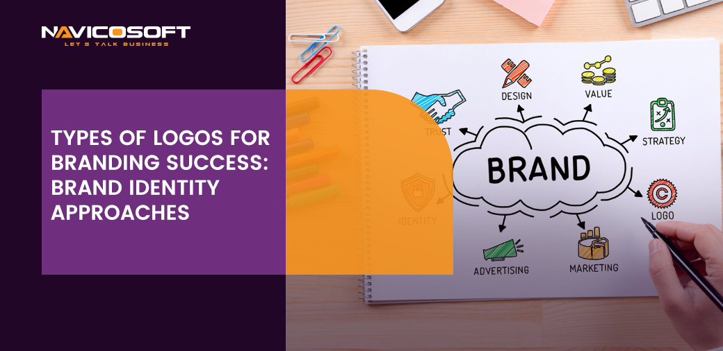
Types of Logos for Branding Success: Brand Identity Approaches
In today’s dynamic and competitive business landscape, a well-crafted logo serves as the cornerstone of a brand’s identity. In addition, a logo has the power to communicate the brand’s essence and leave a lasting impression on consumers’ minds. There are various types of logos for branding success, and they have been in use for decades.
Moreover, these logos provide a history of what is associated with the brand. The key to branding success lies in having a logo and choosing the right type of logo that resonates with your target audience. So let’s look closer at the different types of logos and their implications for successful branding strategies.
Furthermore, a custom brand logo is an unparalleled visual representation that expresses and contains a company’s soul, values, and aspirations. It’s a hard treatment of the brand’s complex identity into a singular, profoundly impactful image. Unlike, in stark contrast to the realm of generic or off-the-shelf logos, a custom logo design is meticulously crafted and meticulously calibrated to resonate harmoniously with the brand’s unique personality. So, it resoundingly resonates with its meticulously delineated target audience. The following are the major types of logos for branding success:
1: Wordmark Logos
Firstly, Wordmark logos are all about making a statement with typography. By skillfully manipulating fonts, colors, and spacing, brands can create a unique typographic representation of their name. This style is particularly effective when the brand name itself carries a strong identity. It is one of the major types of logos for branding success.
Secondly, in the realm of logo design, Wordmark logos emerge as a subtle yet distinctive way to leave an indelible mark on the canvas of brand identity. These logos, adorned with a translucent and often textured overlay, exude an air of sophistication that resonates with elegance and uniqueness. Let’s dive into the enchanting world of wordmark logos, exploring their characteristics and offering a glimpse of brands that have harnessed their allure.
Subtle Elegance and Brand Identity
Now, moving forward, Wordmark logos epitomize understated elegance. By their very nature, they blend seamlessly with the background, creating an aura of sophistication that doesn’t overpower but complements the overall visual composition. In addition, this harmonious coexistence between the watermark and the foreground logo lends an air of exclusivity to a brand’s identity. Following are the mentioned glimpses of examples of wordmark logos:
- Apple: Firstly, the iconic Apple logo is a perfect example of how a watermark can add an extra layer of finesse. Apple’s watermark, often seen on promotional materials and presentations, is a translucent version of its logo, adding a touch of refinement to its branding.
- Louis Vuitton: Secondly, renowned for its luxury products, Louis Vuitton’s watermark logo is used to authenticate its printed materials and packaging. This unobtrusive mark enhances the perception of exclusivity and quality.
- Instagram: Thirdly, Instagram’s watermark logo is a prime illustration of how a subtle overlay can convey brand authenticity. The watermark is occasionally used on promotional images, reinforcing the platform’s brand presence without overwhelming the content.
- BMW: The watermark logo employed by BMW on its official documents and marketing materials imparts an air of sophistication and precision. This delicate addition echoes the brand’s commitment to craftsmanship.
- National Geographic: Also, National Geographic’s watermark, often found in its mesmerizing photographs, aligns with its image as a trusted source of visual storytelling. Hence, this subtle detail enhances the professionalism of the brand’s visual content.
- Microsoft: Also, Microsoft’s watermark logo, seen on presentations and digital materials, exemplifies how a watermark can lend gravitas to corporate branding. It’s a symbol of the brand’s dedication to excellence.
Overview:
Also, wordmark logos offer a refreshing departure in a world of bold statements and vibrant designs. Their understated presence adds depth, texture, and an element of sophistication to brand identities. In addition, by embracing the art of wordmark logos, brands can master the delicate balance between leaving an impression and allowing the content to shine.
2: Symbol or Icon Logos
Symbols or icon logos distill a brand’s essence into a single, recognizable graphic element. These logos often become synonymous with the brand, making them instantly identifiable. Therefore, when executed effectively, a simple symbol can convey complex emotions and concepts. So, it is one of the best types of logos for branding success. Consider the enduring Apple logo, which symbolizes innovation and simplicity, or the iconic Nike swoosh that embodies athleticism and movement.
Symbolic Icons in Logo Design
Moving on, the world of logo design, symbols, or icon logos shines as captivating visuals encapsulating an entire brand story within a singular image. So these logos are used for branding success, built around a distinctive symbol or iconic element, and using the power of simplicity to create lasting impressions.
A symbol or icon logo centers around a singular graphic element representing the brand’s essence, values, or products. In addition, these logos forgo complex details in favor of easy-to-identify symbols that resonate with audiences across cultures and languages.
Unveiling Visual Storytelling with Ease
Undoubtedly, the beauty of symbol/icon logos lies in their ability to convey complex messages with effortless simplicity. Also, these visual narratives eliminate the need for elaborate explanations, offering a glimpse into a brand’s identity with a single glance. Clearly, this ease of understanding makes them an invaluable tool in the branding arsenal. The below mentioned are the examples of types of logos for branding success:
- Apple: The iconic Apple logo, an image of a bitten apple, is synonymous with innovation and design excellence. This simple symbol speaks volumes about the brand’s commitment to sleek technology and user-friendly experiences.
- Nike: The Nike swoosh is a symbol that encapsulates movement, energy, and victory. It’s a prime example of how a minimalist design can evoke powerful emotions and associations.
- Target: The Target logo, a stylized bullseye, communicates precision, focus, and hitting the mark. This symbol resonates with shoppers seeking quality and value.
- Mercedes-Benz: The elegant three-pointed star of Mercedes-Benz symbolizes the brand’s ambition for universal motorization on land, air, and sea. This symbolizes luxury, performance, and timeless elegance.
- Twitter (X): The blue bird icon of the old Twitter is a universally recognized symbol of quick communication and connection. It’s a testament to how a single icon can capture the essence of a platform’s purpose.
- McDonald’s: The golden arches of McDonald’s form an unmistakable M, instantly associated with fast food and convenience. This iconic symbol has become a landmark of gastronomic familiarity.
Overview:
On the other hand, symbol/icon logos exemplify an interesting type of logos for branding and have used the age-old adage that less is indeed more. Also, by distilling a brand’s essence into a singular image, they achieve universality that transcends language and cultural barriers.
Moving on, the allure of symbol/icon logos lies in their accessibility. They invite anyone, regardless of background or expertise, to participate in their narrative. In a world of complexity, these logos refreshingly adhere to the principle of easy elegance. They serve as visual ambassadors of brands, crafting connections and eliciting emotions with a subtlety that resonates profoundly.
Importantly, in embracing the art of symbol/icon logos, brands establish a visual identity and foster a shared understanding with their audience. Thus, the universal language of imagery bridges gaps and forges connections, creating a lasting impact that endures far beyond the confines of pixels and paper.
3: Lettermark Logos
Thirdly, for brands with lengthy names or intricate terminology, Lettermark logos offer an elegant solution. These logos use the initials or acronym of the brand name to create a distinctive visual representation. For instance, with its bold blue lettering, the IBM logo is a prime example of how Lettermarks can convey professionalism and credibility without excessive design elements. So Lettermark logo is one of the high-in-demand types of logos for branding success and creating an identity for it.
In addition, in the world of logo design, Lettermark logos emerge as elegant solutions, transforming brand names into distinctive visual signatures. These logos use the initials or acronyms of a brand to craft minimalist designs that are easy to recognize and recall. Here’s a quick peek into the realm of Lettermark logos, accompanied by simple examples that showcase their enduring appeal.
Furthermore, Lettermark logos revolve around using the initials or abbreviations of a brand’s name to create a memorable emblem. These logos simplify complexity, offering a clean and straightforward brand representation.
Unveiling Easy Elegance
Indeed, this type of logo for branding success has greatly impacted the market. With the help of Lettermark logos, it captivates customers with its easy elegance. Also, by focusing on a select few letters, they concisely encapsulate a brand’s essence. This simplicity contributes to quick recognition, making them particularly effective in digital environments.
Moving forward, the major examples in the spotlight are:
- IBM: Firstly, the iconic IBM logo features bold blue lettering, showcasing professionalism and technological expertise. This Lettermark encapsulates the brand’s commitment to innovation and precision.
- CNN: Secondly, CNN’s logo is a testament to the power of abbreviation. The bold, capitalized letters immediately evoke a sense of news authority and credibility.
- HBO: Third, the HBO logo merges the brand’s initials in a simple yet distinctive design. This Lettermark resonates with entertainment and quality, reflecting the brand’s position in the television industry.
- NASA: Also, NASA Lettermark is synonymous with exploration and innovation. Its bold, futuristic typography captures the agency’s mission to venture beyond the confines of our planet.
- HP: Hewlett-Packard’s Lettermark is a minimalist masterpiece. The intertwined letters exude connectivity and technology, embodying the brand’s dedication to computing solutions.
Overview
Undoubtedly, Lettermark logos exemplify the concept of less is more. Through simplicity, they etch brand identities into the collective memory with utmost efficiency.
Overall, in a digital age where attention spans are fleeting, Lettermark logos stand tall as emblems of easy recognition. They distill brand identity into its core elements, fostering immediate audience connections. In the realm of logo design, lettermarks demonstrate that even a handful of letters can tell a captivating story.
4: Combination Logos
Combination logos blends the power of both words and symbols. These logos offer versatility across various contexts by juxtaposing a carefully crafted symbol with the brand’s name. Brands can use the full combination for formal presentations and the symbol alone for social media avatars or app icons. The Adidas logo exemplifies this approach, featuring its iconic three stripes alongside the brand name.
In addition, Combination logos seamlessly weave text and imagery to create impactful brand identities. These logos merge a symbol or icon with the brand’s name, offering a holistic representation that’s easy to remember. Let’s explore combination logos briefly, with straightforward examples that showcase their visual charm.
Moreover, combination logos ingeniously blend a symbol or icon with the brand’s name. This fusion forms a cohesive and comprehensive visual identity that captures both essence and recognition.
Embracing Visual Harmony
Also, combining text and imagery, combination logos strike a balance that resonates effortlessly. The integration ensures that the brand’s name is remembered while the symbol or icon conveys its ethos.
A few of the examples at a glance are mentioned:
- Burger King: Firstly, the Burger King logo seamlessly intertwines the brand’s name with a flame-like design. This combination evokes warmth and taste, creating a memorable identity.
- Puma: Secondly, Puma’s logo combines a leaping puma with the brand’s name. This cohesive design captures the brand’s energy and athleticism, leaving an enduring impression.
- Adidas: Thirdly, the Adidas logo, with its intersecting stripes and brand name, symbolizes motion and progression. This combination encapsulates the brand’s commitment to sportswear excellence.
- McDonald’s: Ultimately, the iconic McDonald’s logo merges the golden arches with the brand’s name. This combination embodies familiarity and fast-food delight, etching itself into global recognition.
Overview:
Clearly, Combination logos serve as a perfect marriage of text and imagery. As demonstrated by Burger King, Puma, Adidas, and McDonald’s, these logos create an inseparable bond between brand and symbol. They tell a comprehensive story in a single glance, leaving an impression that lingers long after.
5: Emblem Logos
Subsequently, emblem logos harken back to tradition and heritage, resembling intricate badges or crests. These types of logos for branding success play a vital role in integrating the brand’s name and symbol into a single cohesive design. With its crowned mermaid figure encircled by text, the Starbucks emblem is a classic example that exudes authenticity and a sense of craftsmanship.
Nonetheless, emblem logos merge timeless tradition with a touch of modernity, creating iconic visuals that resonate across generations. These logos encase the brand name within a symbol or shape, often resembling a badge or crest. Here’s a glimpse into emblem logos, with examples highlighting their captivating blend of simplicity and grandeur.
Emblem logos encapsulate a brand name within a symbol or shape, often resembling a badge or crest. This design exudes a sense of heritage and authority while maintaining a modern aesthetic.
Combining the Old and the New
Emblem logos offer a harmonious blend of tradition and contemporary appeal. The fusion of brand name and symbol imparts a sense of authenticity, while the design’s clean lines resonate with modern sensibilities. A few illuminated examples are:
- Starbucks: The Starbucks emblem logo features a siren within a circular frame. This design harks back to maritime tradition while embodying the brand’s coffee culture.
- Harley-Davidson: The emblem logo of Harley-Davidson showcases a bar-and-shield design with the brand name. This emblem symbolizes ruggedness and the open road.
- Paramount Pictures: The Paramount Pictures emblem logo incorporates a mountain with stars and a brand name banner. It encapsulates the brand’s cinematic excellence and grandeur.
- Ford: Ford’s emblem logo merges the brand name with an oval shape. This classic emblem evokes a sense of reliability and innovation.
Overview:
Without a doubt, emblem logos epitomize the art of balance and provide types of logos for branding success. Through examples like Starbucks, Harley-Davidson, Paramount Pictures, and Ford, we witness the fusion of heritage and innovation. These logos stand as emblems of legacy, transcending time with their simple grandeur.
6: Abstract Logos
Abstract logos evoke emotions and ideas without directly representing concrete objects by employing geometric shapes, fluid lines, and innovative color schemes. Furthermore, Abstract logos harness the power of artistic interpretation. Pepsi’s dynamic globe-like logo is a testament to how abstract designs can capture attention and spark curiosity.
Also, Abstract logos are an artistic avenue in logo design, utilizing shapes, lines, and colors to evoke emotions and intrigue. These logos eschew literal representation, opting for symbolic interpretations that invite imagination. This is one of the best types of logos for branding success.
Abstract logos harness shapes, lines, and colors to create symbolic representations. They forgo literal depictions, allowing room for interpretation and artistic expression.
Unleashing Creative Imagination:
Abstract logos embrace the allure of artistic interpretation. Their abstract forms spark curiosity and invite viewers to find meaning beyond the obvious. Here are major examples of the abstract logos:
- Nike: Nike’s abstract logo, the iconic swoosh, embodies movement and energy. This simple yet evocative design is universally recognized and resonates with motivation.
- Twitter (X): Twitter’s old abstract logo, a bluebird in flight, symbolizes quick communication and connectivity. This abstract interpretation captures the essence of the platform.
- Apple: Apple’s logo, a stylized apple with a bite, conveys innovation and simplicity. This abstract emblem alludes to the brand’s commitment to cutting-edge design.
- Mastercard: The abstract interlocking circles of the Mastercard logo signify collaboration and financial partnerships. This artistic representation emphasizes the brand’s connectivity.
Overview:
Indeed, Abstract logos are a canvas for creative expression, as exemplified by Nike, Twitter, Apple, Mastercard, and others. These logos foster visual intrigue and emotional resonance. In the realm of logo design, abstraction serves as a testament to the power of simplicity and the elegance of creative interpretation.
7: Mascot Logos
Along with the abovementioned, Mascot logos inject a dose of personality and playfulness into branding efforts. These logos foster emotional connections with consumers by introducing a character or creature that embodies the brand’s values and spirit. The cheerful Michelin Man and KFC’s friendly Colonel Sanders are mascots that have helped elevate brand recognition and relatability.
On the other hand, mascot logos infuse brands with personality by employing characters as their visual representatives. These logos create relatable and memorable connections with audiences, often evoking a sense of friendliness. Here’s a glimpse into the world of mascot logos, along with examples that exemplify their endearing appeal.
Mascot logos enlist characters as brand representatives, imbuing brands with relatable identities. These logos foster emotional connections by bringing brands to life through friendly faces.
Forging Endearing Bonds
Mascot logos evoke emotions akin to meeting a friendly face. They form an immediate and relatable connection, endearing brands to their audiences. Some of the shining examples are:
- KFC: Colonel Sanders, the mustache mascot of KFC, embodies the brand’s heritage and Southern hospitality. His presence invokes a sense of nostalgia and familiarity.
- Michelin: The Michelin Man, a friendly white figure made of tires, represents the Michelin brand. This mascot exudes trust and durability in the world of tires and automotive.
- Tony the Tiger (Kellogg’s): Tony the Tiger’s enthusiastic presence in Kellogg’s logo exudes energy and zest. This mascot reflects the brand’s association with breakfast vitality.
- M&Ms: The M&Ms mascots, each with unique personalities, bring vibrancy and playfulness to the brand. Their cheerful presence resonates with both children and adults.
Overview:
Clearly, Mascot logos animate brands with characters that befriend audiences. Through examples like KFC, Michelin, Kellogg’s, and M&M’s, we witness the power of mascots to instill familiarity and warmth. Moreover, Mascot logos transcend mere design; they create genuine connections that transform brands into cherished companions.
8: Minimalist Logos
Finally, minimalist logos stand out in a world saturated with visual stimuli for their simplicity and clarity. Employing clean lines, ample white space, and minimal design elements can help. These logos epitomize the “less is more” approach. FedEx’s logo, known for its clever hidden arrow, showcases how a minimalist design can communicate a message that resonates on both conscious and subconscious levels. Minimalist logos are one of the best types of logos for branding success.
Further, minimalist logos embrace simplicity to convey complex messages in the most straightforward manner. These logos strip away excess, using clean lines and basic shapes to create memorable visual identities. Here’s a glimpse into minimalist logos and examples that showcase their potent impact.
Minimalist logos distill designs to their core elements, eschewing intricate details. They embody the “less is more” philosophy, relying on simplicity to leave a lasting impression.
Unlocking Sublime Power with Easy Recognition
Minimalist logos wield a sublime power by saying more with less. Their uncluttered designs make them easily recognizable, leaving a profound mark on audiences. A few shining examples are:
- Nike: The Nike logo, a simple swoosh, radiates movement and motivation. This minimalist design embodies the brand’s dynamic spirit and resonates universally.
- Apple: The iconic Apple logo, an apple with a bite, conveys innovation and simplicity. Its minimalist elegance has become synonymous with cutting-edge technology.
- Google: Google’s logo, a playful arrangement of colorful letters, captures the brand’s vibrant and approachable essence. This minimalist design echoes the brand’s user-centric philosophy.
- FedEx: The FedEx logo, with its hidden arrow, represents precision and movement. This minimalist emblem subtly conveys the brand’s commitment to efficient delivery.
Overview:
Indeed, Minimalist logos excel in their elegant simplicity. As demonstrated by Nike, Apple, Google, and FedEx, these logos prove that even a few well-chosen elements can convey profound messages. In the realm of logo design, minimalism is a testament to the remarkable impact of clear, unadorned visuals.
In addition, to make your brand a success, it is important to select the right type of logo, which involves careful consideration of your brand’s values, target audience, and long-term goals. A successful logo doesn’t just adorn your products or website; it encapsulates your brand’s identity and becomes a beacon for your customers. Businesses can choose the right ones from the various types of logos for branding success. But whether you opt for the elegance of a wordmark, the symbolism of an icon, or the fusion of a combination logo, remember that a well-crafted logo is a powerful tool for forging connections, cultivating loyalty, and achieving branding success.
Branding Success
Moving towards the connection of custom logos and branding success. Branding success refers to achieving specific goals and positive outcomes driven by a strong and well-executed brand strategy. It goes beyond having a recognizable logo or catchy slogan; it encompasses the creation of a positive and lasting perception of a company or product in the minds of consumers.
Firstly, branding success is achieved when a brand can effectively communicate its values, establish a unique identity, foster customer loyalty, and ultimately lead to increased customer engagement, trust, and business growth. It involves consistently delivering on promises, providing exceptional experiences, and building emotional connections with customers that transcend mere transactions.
Brand identity approaches refer to the various strategies and methodologies businesses use to develop and present their brand’s identity to the public. These approaches encompass a range of decisions related to visual elements, messaging, values, and overall brand positioning. With the help of these approaches towards various types of logos for branding, success can make up to huge markup profit for brands. By adopting specific approaches, companies aim to create a distinctive and memorable brand identity that resonates with their target audience. Here are some common brand identity approaches:
1: Visual-Centric Approach
As well as that in this approach, the emphasis is on creating a strong visual identity through elements like logos, color palettes, typography, and design aesthetics. Also, brands adopt consistent visual elements across all touchpoints to ensure instant recognition and a cohesive brand image.
2: Storytelling Approach
This approach focuses on crafting a compelling brand story that connects with the brand’s audience on an emotional level. By sharing the brand’s origin, values, mission, and the challenges it overcame, companies build a narrative that resonates with their audience’s aspirations and values.
3: Minimalist Approach
The minimalist approach emphasizes simplicity and clean design. Brands following this approach often use minimal colors, streamlined typography, and uncomplicated design elements to create a sleek and modern image.
4: Authenticity Approach
Brands that adopt an authenticity approach prioritize transparency, honesty, and a genuine connection with their audience. They highlight their values, ethical practices, and real people behind the brand to build trust and relatability.
5: Experience-Driven Approach
This approach centers on providing exceptional customer experiences that align with the brand’s identity. Every interaction, whether online, in-store, or through customer service, is carefully designed to reflect the brand’s values and create positive associations.
6: Symbolic Approach
Brands using a symbolic approach often associate their brand with particular symbols or imagery. These symbols may represent ideals, aspirations, or emotions the brand aims to evoke in its customers.
7: Lifestyle Approach
A lifestyle approach involves aligning the brand with a particular lifestyle or set of values that resonate with the target audience. Brands adopting this approach aim to become a part of their customers’ lifestyles and represent their preferences and aspirations.
8: Innovation Approach
Brands that focus on innovation position themselves as pioneers in their industry. In addition, they emphasize their commitment to cutting-edge technology, forward-thinking solutions, and constant improvement.
9: Human-Centric Approach
This approach revolves around putting people at the center of the brand’s identity. So, brands adopting this approach prioritize customer needs and create experiences tailored to individuals, fostering a sense of personal connection.
10: Nostalgia Approach
Some brands tap into nostalgia by evoking memories of the past. They use design elements, imagery, or even product offerings that remind consumers of a bygone era, creating a sense of familiarity and comfort.
Ultimately, the choice of brand identity approach depends on the company’s values, target audience, industry, and competitive landscape. Therefore, businesses must carefully consider which approach aligns best with their overall brand strategy and goals creating a memorable and impactful brand identity.
Brand Identity
Moreover, a brand creates an identity for its owner through a combination of visual, emotional, and experiential elements that come together to form a distinct and recognizable image in the consumers’ minds. Here’s how a brand builds an identity for its owner:
Visual Identity
Firstly, a significant aspect of brand identity is its visual representation. This includes logos, color palettes, typography, and design styles. These visual elements are carefully chosen to convey the brand’s personality, values, and positioning. For example, a luxury brand might use elegant fonts and sophisticated colors to communicate exclusivity.
Brand Messaging
Secondly, effective brand messaging, including slogans, taglines, and mission statements, plays a crucial role in creating an identity. Consistent and compelling messaging helps consumers understand what your brand stands for and what it promises to deliver. Therefore, this messaging should resonate with the target audience and differentiate the brand from competitors.
Emotional Connection
Thirdly, brands often aim to evoke emotions and connect with consumers on a deeper level. So, they can foster emotional connections by creating a brand story that appeals to the audience’s values and aspirations. Also, sharing the brand’s origin, values, and the problems it aims to solve creates a narrative that consumers can relate to.
Customer Experience
Moreover, the experiences customers have with a brand greatly influence its identity. So, delivering exceptional customer service, providing high-quality products, and ensuring a seamless user experience contributes to a positive brand perception. As a result, positive interactions lead to loyal customers who associate the brand with reliability and satisfaction.
Associations and Symbolism
Ultimately, brands may become associated with specific symbols, images, or ideas. For instance, the Nike swoosh is synonymous with athleticism and innovation. These associations become part of the brand’s identity and can evoke certain feelings or thoughts when consumers encounter them.
It should be noted that a brand’s identity is a combination of its visual elements. Such as messaging, experiences, emotions, and associations that collectively define how consumers perceive and connect with the brand. Through careful planning, consistent execution, and genuine interactions, a brand can successfully create an identity that resonates with its owner and target audience alike.
Crafting a custom brand logo as a catalyst for elevating brand success
Secondly, moving on towards a custom brand logo. In today’s dynamic and visually driven business landscape, well-crafted custom brand logos stand as a resplendent beacon of recognition and identity. It’s not merely an image. Whereas it’s a potent emblem that profoundly shapes perceptions, evokes profound emotions, and indelibly etches itself onto the consciousness of consumers.
So, what precisely do we mean by a custom brand logo? Let’s delve deep into the multifaceted intricacies of this concept and explore how it plays an incontrovertibly pivotal and transformative role in building a brand’s success.
A Multifaceted Artistry
Firstly, every custom brand logo, irrespective of its apparent simplicity, serves as an invincible thread woven into the grand tapestry of brand identity. So a well-crafted logo, in all its aesthetically orchestrated glory, efficaciously communicates profound narratives in a fleeting glance. That, in return, contributes to intrigued viewers with an intimate and tantalizing glimpse into the very essence of what the brand represents.
Creating a Lasting Impression
Secondly, an exceptional and impeccably distinct logo emerges as the pivotal beacon of light in a tumultuous sea awash with a dizzying array of stimuli. That elegantly guides wandering eyes and discerning minds towards the coveted shores of brand distinction. It’s more than just an image. The quintessential visual cue triggers a cascading flow of recognition, guiding consumers toward the heart of a singularly distinct brand identity amidst an ocean of seemingly interchangeable options.
Building Brand Recognition
Thirdly, the journey of recognition, an odyssey of cognitive connectivity, is masterfully propelled by the consistent. And strategically calibrated exposure of a singular custom logo design across a multifarious spectrum of virtual and tangible touchpoints. Whether it’s a captivating online interface or the tactile appeal of physical packaging, the uniformity of a bespoke logo meticulously reinforces a coherent and cohesive brand image, further propelling its distinctive attributes into the collective consciousness of an increasingly discerning and visually literate consumer base.
The Logo’s Sublime Alchemy
Moreover, transitioning beyond the realm of recognition, the custom brand logo extends its alchemical influence into the sphere of emotions and associations. So, this singular emblem can ingeniously evoke an expansive spectrum of emotions and cultivate profound associations. A masterstroke in design, such as the iconic Nike swoosh.
Forging Emotional Connections
Furthermore, by transgressing the boundaries of association, the custom logo elegantly ushers us into the realm of forging unparalleled emotional connections. The emotionally resonant qualities meticulously embedded within the logo’s aesthetic essence underpin this transcendental transition from recognition to connection. The logo converts to forging emotional bonds in the space between pixels and paper. Also, it creates an intimate interplay between brand and consumer that far surpasses transactional norms. Therefore, this transformation, realized through the visually orchestrated symphony of shapes, colors, and symbolism, has the transformative potential to transmute ordinary customers into passionate brand advocates.
Final Musings
Finally, the journey of a custom brand logo reveals itself to be nothing short of a symbolic odyssey. From its birth as a design to its resounding impact on the grand stage of branding, the recognition, emotions, and connections. Its transformative abilities are akin to alchemy, turning mere shapes and colors into vessels of profound meaning.
Even so, like a painter’s brushstrokes, each line and curve of a custom logo speaks a language of its own. It harmoniously intertwines with the symphony of marketing efforts, weaving a narrative that resonates with audiences, both near and far. It’s a silent but eloquent ambassador, effortlessly transcending cultural and linguistic boundaries.
Conclusion
Particularly in brand success, a custom logo unfurls its wings to elevate a brand from the ordinary to the extraordinary. Among the business stationery, the logo has the most significant impact on a brand. It’s a constant reminder that branding is more than transactions; it’s about experiences, emotions, and relationships. The impact of a logo is felt not just in the digital world but in the hearts and minds of consumers who become part of a brand’s story.
In recent years, businesses have employed various types of logos for branding success, depending on their niche.
However, the logo isn’t just a static symbol; it’s a living entity that evolves alongside the brand. Just as the brand adapts to changing times, the logo flexes its creative muscles to reflect the brand’s evolution while keeping its core intact. It’s a visual cue that echoes a brand’s flexibility and ability to weather the storms of change.
Without a doubt, it should be noted that a custom logo isn’t merely a design element. Instead, it’s a testament to a brand’s ethos, a mirror reflecting its values and aspirations. In addition, it’s a touchpoint that invites consumers to engage, experience, and embrace the brand’s essence.
As the curtains draw on our exploration, whether it’s the Nike swoosh or the Apple emblem, the custom logo is more than a visual. It’s the very soul of a brand, an emblematic catalyst propelling it towards a glorious future and brand success.